When you work on a website long enough, it’s easy to keep finding one more thing to change.
Another sentence. Another button. Another spacing adjustment. Another idea for a section that might make the site a little better.
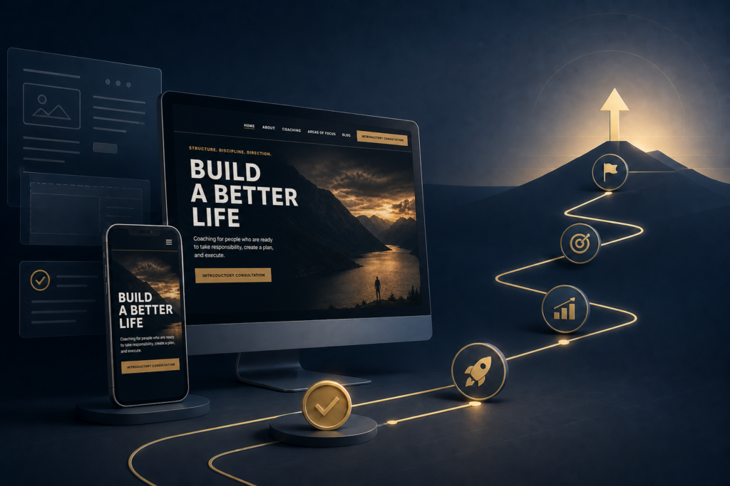
I ran into that point while finishing The Bardi Shop website for Steve Bardi.
We had already worked through the strategy, visual direction, page structure, mobile layout, copy, calls to action, consultation process, and the final round of client revisions. The site looked good. It worked. The messaging was clear.
At that point, the question wasn’t really, “Can we improve this?”
Of course we could.
The better question was, “Is continuing to work on the website actually helping the business?”
Eventually, you have to stop building the website and let the website start doing its job.
A Website Doesn’t Need to Explain Everything
One of the easiest ways to overwork a small-business website is to keep adding information.
There’s always more you could explain about the business, the process, the services, the philosophy, or the person behind it.
But that doesn’t necessarily make the site better.
For The Bardi Shop, the website really needed to answer a few basic questions:
- Who is Steve?
- What does he do?
- How does he work?
- What can he help someone with?
- And what should that person do next?
Once those answers were clear, adding more and more explanation would have started working against us.
A website shouldn’t feel like a manual someone has to finish reading before they can contact you.
Its job is to give someone enough information to understand the business, feel comfortable taking the next step, and make that next step easy.
Consistency Matters More Than More Copy
One of the final things we worked on wasn’t adding new content. It was making the existing content more consistent.
The Bardi Shop had several related ideas running through the site, so we established a clear messaging hierarchy.
The primary brand statement became:
Clarity. Structure. Action.
The coaching process became:
CLARIFY → CONTROL → PLAN → EXECUTE → PROGRESS
And Structure. Discipline. Direction. stayed in place as a supporting philosophy.
Those ideas were already part of the website. The important part was making sure they had clearly defined roles instead of competing with one another.
That’s a good lesson for almost any small-business site.
If every page describes your business differently, the visitor has to do extra work to figure out what you actually stand for.
Sometimes the best final revision isn’t adding anything.
It’s removing the inconsistencies.
The Call to Action Should Be Obvious
Another thing we standardized was the main call to action.
For Steve, that was:
Schedule an Introductory Consultation.
Simple.
The wording didn’t need to change depending on which page someone happened to be reading.
If the desired next step is the same, the site should reinforce it consistently.
I see this fairly often on small-business websites. One page says “Contact Us,” another says “Get Started,” another says “Learn More,” and another says “Book a Call.”
Those may all lead to the same place, but the visitor shouldn’t have to figure that out.
Pick the action you want people to take and make it easy to recognize throughout the site.
Mobile Is Part of the Website, Not a Final Add-On
Before considering the project finished, we did another mobile QA pass.
That meant checking things like:
- Heading wraps
- Section spacing
- Button text
- Navigation behavior
- Large headlines
- Form usability
- Disclaimer readability
- Horizontal overflow
None of that is especially glamorous, but it matters.
A homepage can look great on a large monitor and still feel awkward on a phone.
And for a lot of businesses, a phone may be the first place a potential customer ever sees the website.
Mobile testing shouldn’t be something you do at the very end just to make sure nothing is completely broken.
It should be part of deciding whether the site is actually ready.
The Owner Should Be Able to Use the Website
This was another important part of The Bardi Shop project.
I didn’t want Steve to end up with a website that looked good but required him to contact me every time he wanted to change a paragraph.
So we maintained native WordPress Gutenberg block functionality for the content he should reasonably be able to edit himself.
Steve can update things like:
- Headings
- Paragraphs
- Images
- Links
- Lists
- Blog posts
- Appropriate CTA text
without touching HTML.
At the same time, the design-critical parts of the site stay protected.
That includes things like the global header, site styling, responsive behavior, forms, navigation, spacing system, and other structural components that could cause problems if they were changed accidentally.
I think that balance is important.
A small-business owner shouldn’t be dependent on the developer for every routine content change.
But they also shouldn’t be able to accidentally drag a major section out of place and break the mobile layout while trying to change one sentence.
My goal was simple: Steve should be able to handle normal content updates without being able to accidentally pull the layout apart.
Test the Actual Customer Path
Before calling the site finished, we also tested the path a real visitor would take.
Not just whether the pages loaded.
Could someone understand the business?
Could they find the Areas of Focus?
Could they get to the consultation page?
Did the consultation form work?
Did required fields behave correctly?
Did the confirmation message appear?
Was the inquiry actually recorded in WordPress?
That last part matters.
A button looking correct doesn’t mean the business process behind it works.
The website needs to be tested from the visitor’s point of view, all the way through the action you want them to take.
Knowing When to Stop Is Part of the Work
I think this may have been the biggest lesson from the project.
There is always something else you could change on a website.
But there comes a point where continued tweaking has diminishing returns.
Once the site clearly explains the business, looks professional, works on mobile, gives the owner the right level of editing control, and successfully moves a visitor toward the next step, it’s probably time to stop treating it like a design project.
The next job is getting people to use it.
- Creating useful content
- Improving the consultation experience
- Building visibility
- Driving the right visitors to the site
- Learning from what those visitors actually do
That’s when the website starts becoming part of the business instead of something sitting in development.
The Bardi Shop
The Bardi Shop project is now at that point.
The core website is finished.
The design and messaging are in place, the consultation process works, and Steve can handle routine updates without touching HTML. Steve can manage routine content through WordPress without dealing with HTML, and the parts that could break the site remain protected.
Now the focus can shift from building the website to using it.
And in my opinion, that’s exactly where a small-business website should eventually end up.
Want to see how the project came together?
Read the full The Bardi Shop Website Case Study to see the strategy, visual direction, WordPress build, responsive refinement, and final result.
If you’re working with a website that feels unfinished, inconsistent, difficult to update, or just isn’t doing much for the business, that’s also the kind of problem I look at through the JCWEB Digital Health Audit™.